Building Performance is a science very few people outside of the AEC industry understand. Yet buzzwords like green building, sustainable design, and high performance are topping out the list of every proposal request and competition requirement. Where does that leave design teams chasing
pursuits?
Teams not only need to be adept at performance analysis, but also need to demonstrate data-driven approaches in their design. Undertaking and synthesizing a design approach into welcoming, legible, and educational diagrammatical content is an essential part of making a performance diagram.
Here are 5 Steps to make performance Diagram for your Project Pursuit
Identify why a performance diagram is needed
Diagrams should only be used when the journey from point A to point B can aid a viewer to draw the same conclusions as you. For instance, imagine a proposal presenting an argument for a certain building mass and glazing placement with just a rendering. Onlookers would see a design proposal and may only have the picture to judge. Their criteria would have to be about judging the aesthetics – either they will like or won’t, but since they have nothing else to get to know or hear about your design intentions, their judgement will be swift and uncertain.
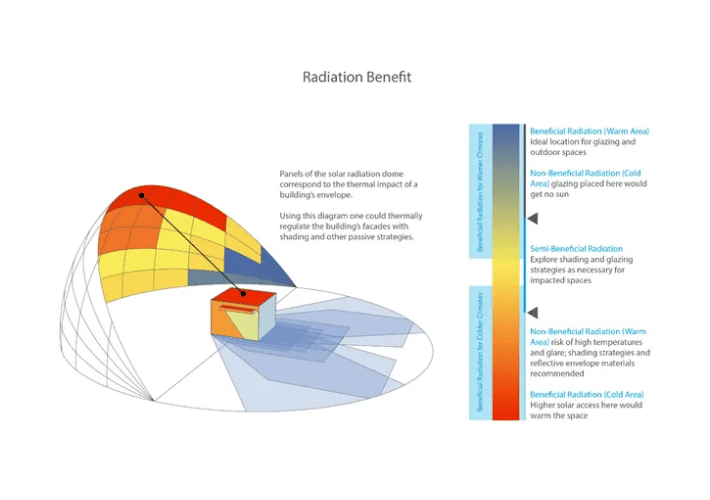
This can be avoided if you made a case for massing and used a climate analysis diagram such as a solar radiation map that identified the facades which received the most beneficial radiation . Further, using this data to orient your building and locate your glazing takes this a step ahead. Having a diagram that demonstrates why you were able to immediately filter out various design options would be incredibly useful for building owners to get to know how your mind works and that you would work with the owner to understand their building.
Map out the Journey in strokes
A good diagram will quite literally map out the journey from point A to point B. A not so effective diagram will feel the need to take every step and decision until the information eventually becomes overwhelming and indigestible. Try mapping out your journey in a sketch, identifying the big jumps from one key moment to the next, perhaps one massing to another. When you equate these jumps to strokes you should be able to identify the underlying drawing which will then make your diagram flow. The viewer will know where to look if they have a question and how you were able to draw a conclusion.
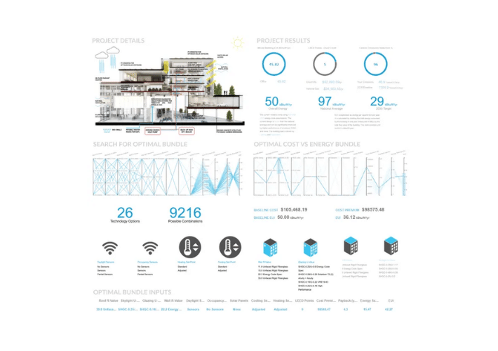
Identify key metrics:
This is an article about building performance, so to get back on topic – now is the time to educate a non-building-performance expert. With the underpinning sketch laid out, it is time to see how numbers from both the input and outputs can be used to make a compelling case. The typical metrics that most in the AEC industry understand and use are EUI (Energy Use Intensity), Carbon Emissions and Payback. A more detailed guide on 5 performance metrics that every architect should know can be found here.
Assign weight to various components
Some points on a diagram are more important that others, so they should take visual precedence. By making some areas more dominant than others, viewers should want to know more and get behind the idea you have identified as more important.
Go back and purge
Building performance diagrams can sometimes get too heavy and cramped. Get some feedback, a second eye, and purge the excess. Diagrams which work best for building performance pursuits should not be debatable. They are simply your approach synthesized and a tool to explain a concept without struggle.
Working on your own performance diagram? Start with collecting all the metrics for your building.