Designing with passive strategies is about understanding the constraints and creating design responses that do not require active mechanical systems, like using ambient energy sources to cool, heat, shade, or ventilate a building space.
The challenge with designing passive strategies is that they must be incorporated in the early stages of the process if they are to be effective.
Climate Diagrams and Weather Files
Starting with the connection between climate diagrams and weather files, a weather file is a spreadsheet containing daily observations of temperature, humidity, wind, solar radiation, and precipitation for each hour of an average year.
Weather files are used by energy modelers and building consultants in simulations where the heat flowing into and out of the building is measured.
To visualize the weather data, several climate diagrams are typically generated to view different parameters so that conclusions on passive strategies can be formed.
These climate diagrams break down key concepts that are imperative to building energy-efficient buildings.
1. Relative Humidity and Temperature Diagrams
The first concept we are going to review is the Relative Humidity and Temperature Diagrams. These diagrams make up a climate’s primary comfort conditions and are dynamically used in several approaches to generate the rest of the climate diagrams. Understanding these two diagrams can help differentiate between using one approach to improve comfort conditions versus using the same approach to worsen them.
Relative Humidity (RH)
Relative Humidity (RH) is the amount of moisture in the air relative to what the air can “hold” at that temperature. Relative Temperature, also known as dry-bulb temperature (DBT), is the temperature of air measured by a thermometer freely exposed to air but shielded from radiation and moisture. Both relative humidity and dry bulb temperature are used to predict the thermal comfort of occupants during critical time intervals.
Energy Use Intensity (EUI)
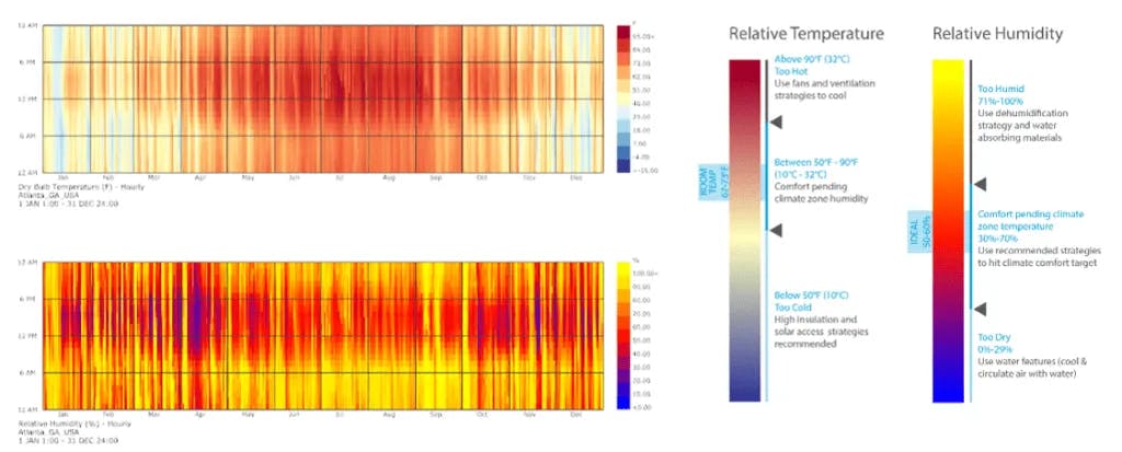
In certain climate zones, experts may determine most of a project’s Energy Use Intensity (EUI). On the left (of the above image) is a typical representation of an hourly recording for a typical year in a specific location, in this case, Atlanta, GA.
The legends indicated in degrees Fahrenheit (°F) for DBT and percentage (%) for RH correlate with the calendar’s seasonal climate conditions. The vertical axis is the time of day and the horizontal axis month in the year. By looking at the diagram, one can pinpoint when strategies might be preferable.
Relative Temperature Diagram
In the case of Atlanta (as per the above image), the Relative Temperature Diagram indicates that throughout the day from April to September, the temperature can be expected to be at least, on average,50°F and above, between the hours of 9 am and 6 pm being too hot for typical building occupant comfort.
In this case, the above cove.tool diagram recommends using fans and ventilation strategies to cool your space. For this passive strategy, it must be implemented early on, rather than being underutilized and later replaced with costly and energy-hungry air conditioning.
In the Relative Humidity Diagram, Atlanta is a very humid climate year-round with spikes of “too humid” specifically in the morning and afternoon. This situation could be improved by using dehumidification and water-absorbing materials.
Below, additional examples have been added for some of the hottest and coldest locations in America for comparison. Left, Phoenix Arizona, and right Barrow, Alaska.
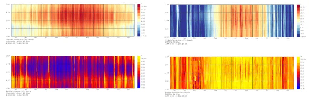
In these extreme locations, you can see the drastic difference in the visualization of each diagram. Also, you can start examining other strategies to be implemented in these regions.
For example, the Barrow, Alaska dry bulb diagram is dominated by cooler temperatures, with the high point of the legend beginning at 57°F. In this case, the cove.tool help legend recommends high insulation and high solar access to allow for heat gain. An easy design recommendation for a quick sustainability win.
Compared with Phoenix, Arizona where the Relative Humidity Diagram shows a predominately dry climate a strategy of water-based evaporative cooling should be used. For example, a courtyard with a pool could used to circulate cool air through an atrium to cool the spaces.
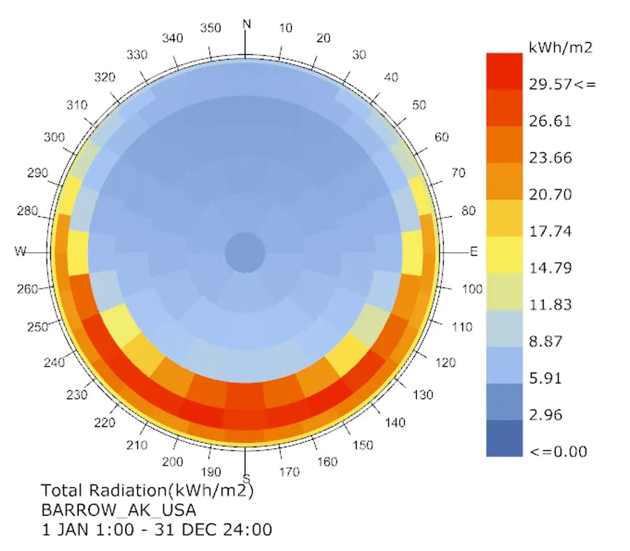
2. Radiation by Sky Segment Diagram
Also known as the Radiation Dome, this diagram chronicles the sun angle and solar intensity at which sunlight strikes an area.
The Radiation dome is used in the design process to determine how to orient the building, and if the flexibility of orientation is not applicable, where to put the maximum glazing percentage in the project.
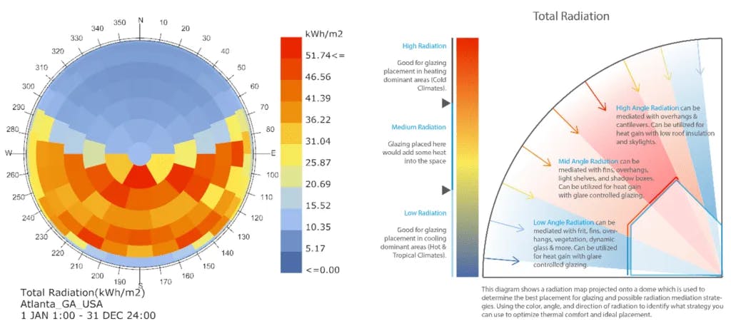
For a building in Atlanta, the Radiation Dome shows that most direct sunlight comes in from East-South-West at mid to high-angle segments. Reading this and knowing Atlanta is a slightly heating dominated climate (“heating dominated” means a location whose EUI is dominated by heating loads), we can reference the diagram on the right to pick a strategy.
The best passive strategy to carry forward is placing more glazing in Northeast, North, and Northwest facades where radiation is lower (the blue angles).
In areas facing the other cardinal directions, glazing should be used sparingly. Keep in mind the hot, high angles by considering shading with overhangs, and fins, and one should keep an eye out for glare discomfort.
If we look again at an extreme weather location, like Barrow, Alaska radiation dome (below) we can see a very different shape and preferred strategy. In Barrow, the heating dominant climate would want to utilize high radiation for heat gain. Placing glazing in these locations would be a great improvement to comfort.
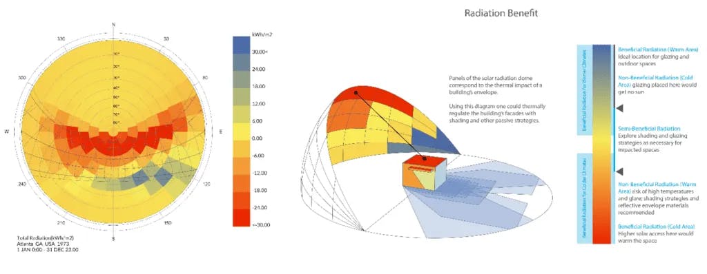
3. Radiation Benefit Diagram
The Radiation Benefit Diagram has a similar representation to the Radiation by Sky Segment above, but a different focus on the conclusions that should be drawn. The difference is it differentiates the “good radiation” from the “bad radiation."
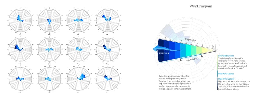
3. Wind Diagram
Using this graph one can identify a climate zone’s prevailing winds. Knowing the prevailing winds, we can identify the best building facades to use for passive ventilation strategies such as operable window placement. Atlanta’s calendar wind analysis has fairly varied winds over the year, but between the cooler months of October through February, a strong Northwest wind dominates the climate stream.
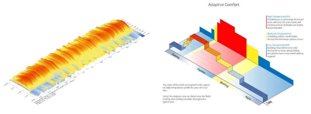
4. Adaptive Comfort
As defined by the ASHRAE Standard 55, thermal comfort success in commercial buildings is defined as a comfort level that meets the needs of 80% of its occupants.
However, thermal comfort depends on far more than just the temperature of the air—it also takes into consideration the environmental factors of mean radiant temperature, relative humidity, and air velocity, and the incorporation of highly variable personal factors like the amount of clothing, physical activity, and more.
This adaptive comfort chart showcases the expected daily comfort profile for your site location. Using this Diagram, one can determine the likely heating, cooling, and de/humidification schedule throughout a typical year.
5. Psychrometric Chart
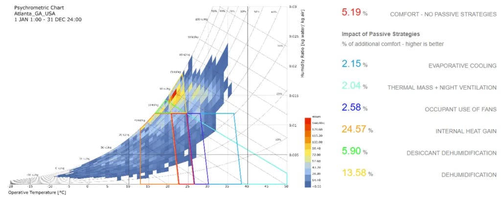
Using the graph, one can determine the number of hours per year a specific physical and thermodynamic condition occurs in a specific climate zone. Each opaque block represents the number of hours where a specific condition occurs. Overlaid polygons are used to identify specific that add to the annual percentage of hours an occupant would be comfortable.
A higher percentage is better, i.e. more hours where no mechanical support is necessary. Use the polygon glossary below to understand what strategy can be used to improve comfort.
Passive Strategies for Building Design
Wrapping up the discussion on passive strategies for building design, it's clear that architects and designers have a powerful toolkit at their disposal for creating energy-efficient and sustainable structures.
By harnessing the natural elements—such as sunlight, wind, and temperature variations—buildings can achieve optimal comfort levels while minimizing environmental impact and operational costs.
The key lies in understanding and applying these passive strategies from the project's inception, ensuring that buildings not only coexist harmoniously with their environments but also contribute to the well-being of their occupants.