Architect: Houser Walker Architecture, Pond
Landscape Designer: Pond
MEP Engineers: Pond
Contractor: Ajax
Sustainability Consultants: Pattern r+d
01 Project Profile
Georgia Tech Public Safety Facility – At 30,000 sq. ft., the new Campus Safety Building will give GTPD a home to enhance its work in maintaining a safe campus environment. The department will be expanding to include a Criminal Investigations Division, a K9 program, an Office of Emergency Preparedness, and other specialized units to protect the campus community. Additionally, the department monitors over 1,700 security cameras in its communications center, where dispatchers and student video technicians keep a careful eye on the campus. This facility will replace obsolete police facilities, consolidate the units into one location, and modernize police functions. Georgia Tech hand-picked a design team to effectively address the programming of the public safety component, sustainability, and community presence.
02 Understanding the Climate
Climate Data – A basic understanding of the existing climate conditions is vital for making performance design decisions. Optimizing the massing design during early-stage modeling makes sure the building is energy efficient without additional cost impacts. Using a range of climate analysis diagrams to shortlist strategies in terms of building shape, orientation, or glazing percentage collectively correlates to the building’s final energy and cost performance.

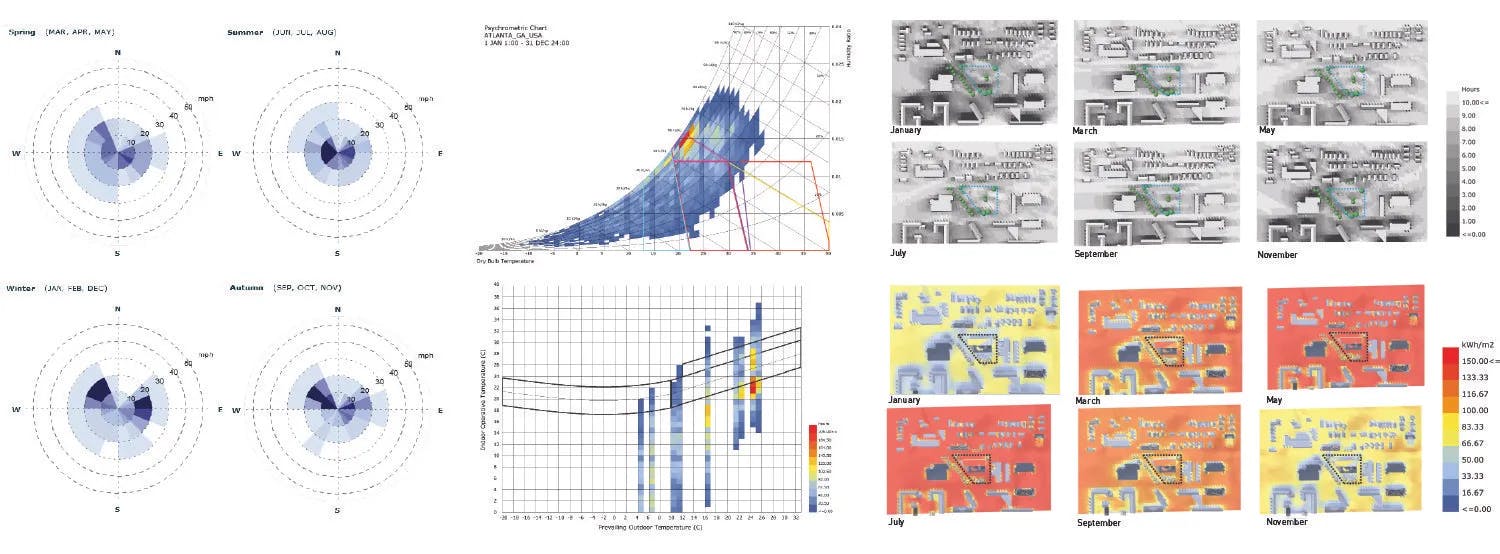
Yearly Temperature
The yearly range of temperatures for dry and wetbulb conditions indicate that Atlanta is a hot humid climate that has a surprising amount of days that require heating. Counterintuitively, there are often slightly more cooling than heating days.
Solar Radiation
The yearly solar radiation for Atlanta shows that the summer months have less direct solar (in red) and more diffuse solar radiation (in yellow). This is the result of more clouds during the summer rainy season.
Humidity vs Temperature
Atlanta exhibits wide swings in the humidity level from day to night during the summer making natural ventilation unlikely. Red is humidity and green is temperature.
Total Radiation
This Radiation Rose shows the direction and intensity of solar radiation on a yearly basis around the cardinal points for Atlanta. We can see that the sun does in fact shine in from the north, primarily in the winter. We can see that providing solar access in the winter to the low northern sun can help with heating in this mixed climate type.
Radiation by Sky Segment
This graph maps the radiation onto a sky dome to show the intensity of the direction and intensity of solar radiation on a yearly basis around the cardinal points for Atlanta. We can see that providing solar access in the winter to the low northern sun can help with heating in this mixed climate type.
Wind Rose by Season
Atlanta exhibits fairly constant low speed winds from the west and east. Wind power is not a viable option and little in the way of natural ventilation can be expected. A quick look at the summer graph confirms that there is very little wind during the hottest time of the year.
Psychometric Chart
This chart shows the relationship between drybulb, humidity ratio, and enthalpy. The polygons overlaid on the chart represent different strategies to increase comfort. According to this chart, the only strategies for improving comfort in Atlanta involve allowing internal heat gain (beneficial in the winter) and desiccant dehumidification (beneficial in the summer). Thermal mass, use of fans, and evaporative cooling have no effect on comfort.
Adaptive Comfort Chart
Here we see the total hours of the year plotted Indoor vs Outdoor temperature with a polygon representing comfort. This graph is effective for understanding the possibilities for natural ventilation. It is clear that the vast majority of the hours of the year are falling outside the comfort band. Thus mechanical strategies are best for achieving comfort.
Shadow Maps
Here we see the number of hours of shadow mapped onto the site. It is clear from these diagrams that the surrounding context buildings are providing little in the way of protection. The existing trees however provide shade to the southern path of the site in the summer.
Radiation Maps
Here we see the radiation (kWh/m2) mapped onto the proposed site plan showing the effects of direct solar on the site. There is substantial sun to the east of the site while the lower part proves to be a great way to establish a micro-climate without direct solar radiation.
03 Setting up Benchmarks
Benchmark Data – A basic understanding of target values is key to comparing performance design decisions.
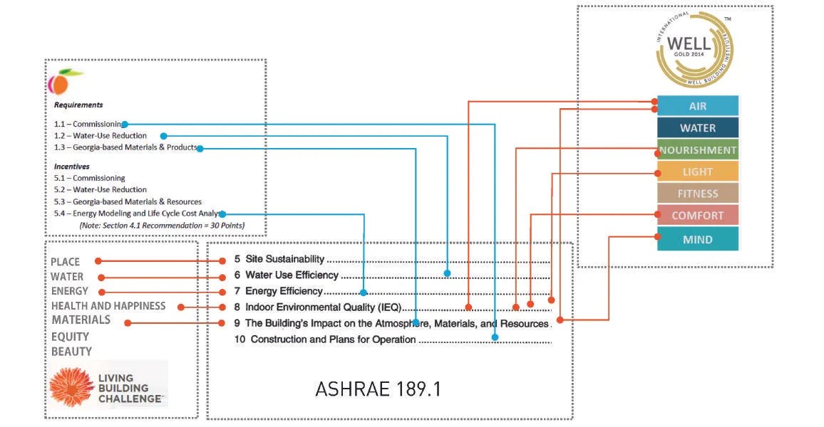
Standards
This public safety facility is pursuing ASHRAE 189.1, WELL Building, Georgia Peach and any possible petals from the living building challenge. With so many standards in play, we started mapping them to understand all the correlations.
04 Massing Studies
Testing Multiple Massing Schemes Proposed by the Design Team
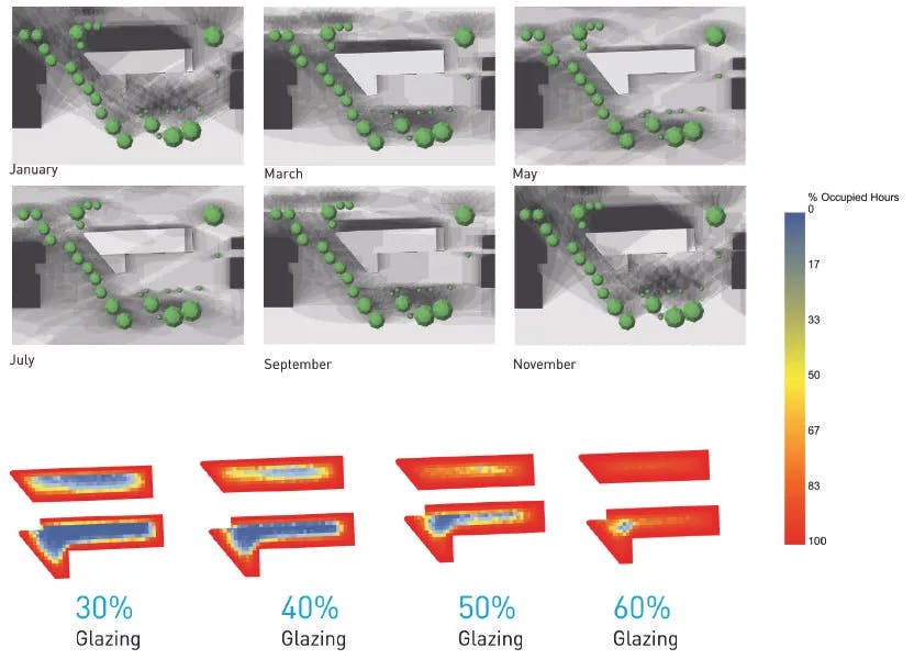
Scheme 1 - This scheme shows one possible massing for the program on the site. The L shape creates a shaded side courtyard on the site. This scheme requires at least 60% glazing to allow the daylight to penetrate deep into the floor plate.
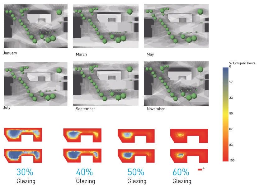
Scheme 2 - This scheme shows one possible massing for the program on the site. It creates a shaded North facade. The central courtyard created would also serve as a good shaded outdoor space during summer months. This scheme requires at least 60% glazing to allow the daylight to penetrate deep into the floor plate.
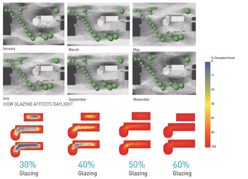
Scheme 3 - This scheme shows one possible massing for the program on the site. It creates a shaded North facade and get away with 50% glazing to allow the daylight to penetrate deep into the floor plate.
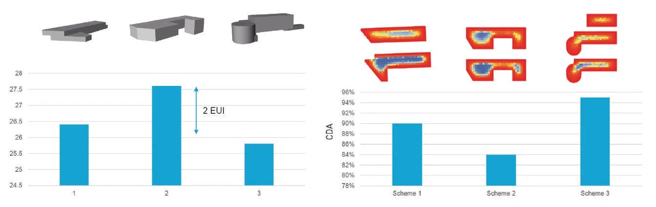
Alternative Tests
When comparing the three schemes for EUI (Energy Use Intensity), Daylight (cDA), and Solar access, scheme 3 is a clear winner using the lowest amount of energy, but still allowing the highest amount of daylight penetration. Its only setback is its low solar access, which can be resolved by adding solar panels on parking structures on site. By viewing all the information at the same time one can see the overall impact of each scheme.
Shortlisting Options
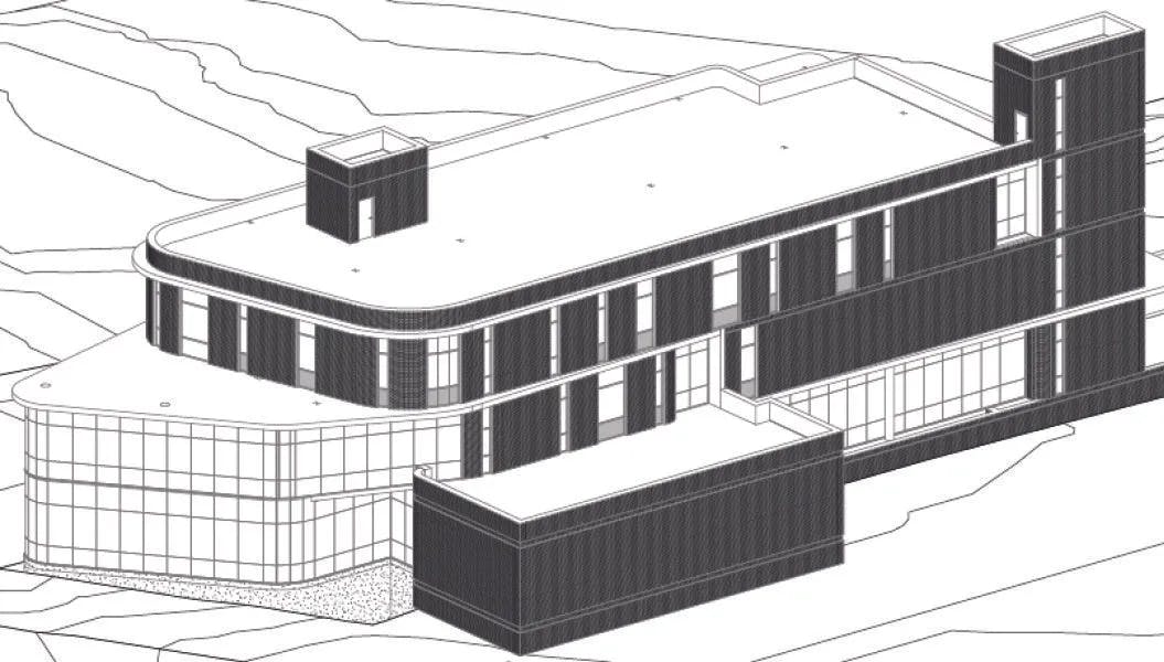
Using the analysis done at the early stage comparing the three different massing schemes, the design team evolved the best option (scheme 3) to further in the scheme shown on the left. Now we had more information about the building fenestration and possible elevation design.
SCHEME 3 Developed
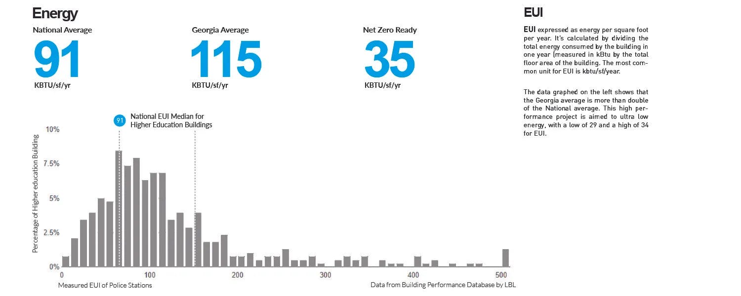
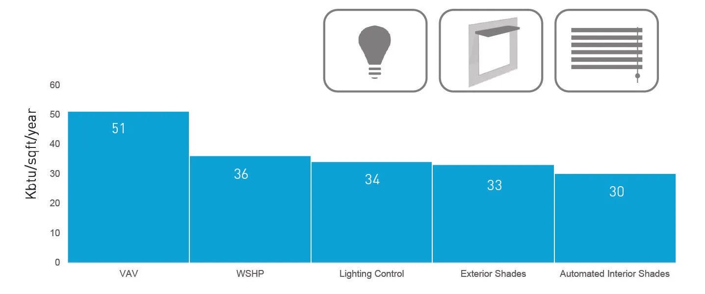
EUI
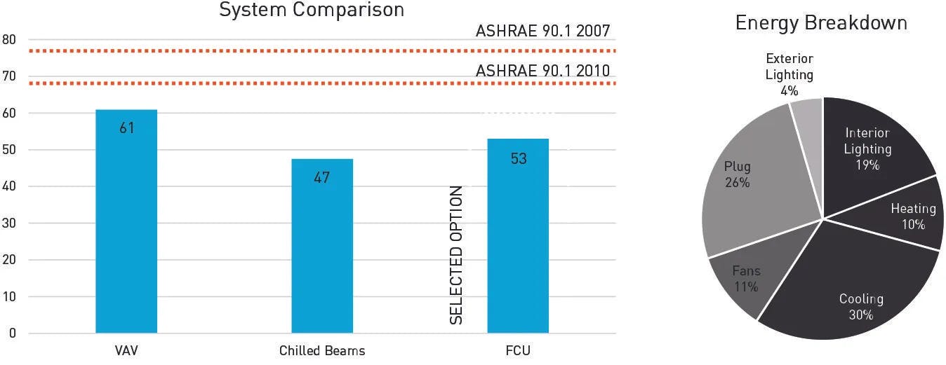
As the compared different massing schemes and held the HVAC system constant, now we held the scheme constant and tested multiple HVAC systems to understand their return on investment.
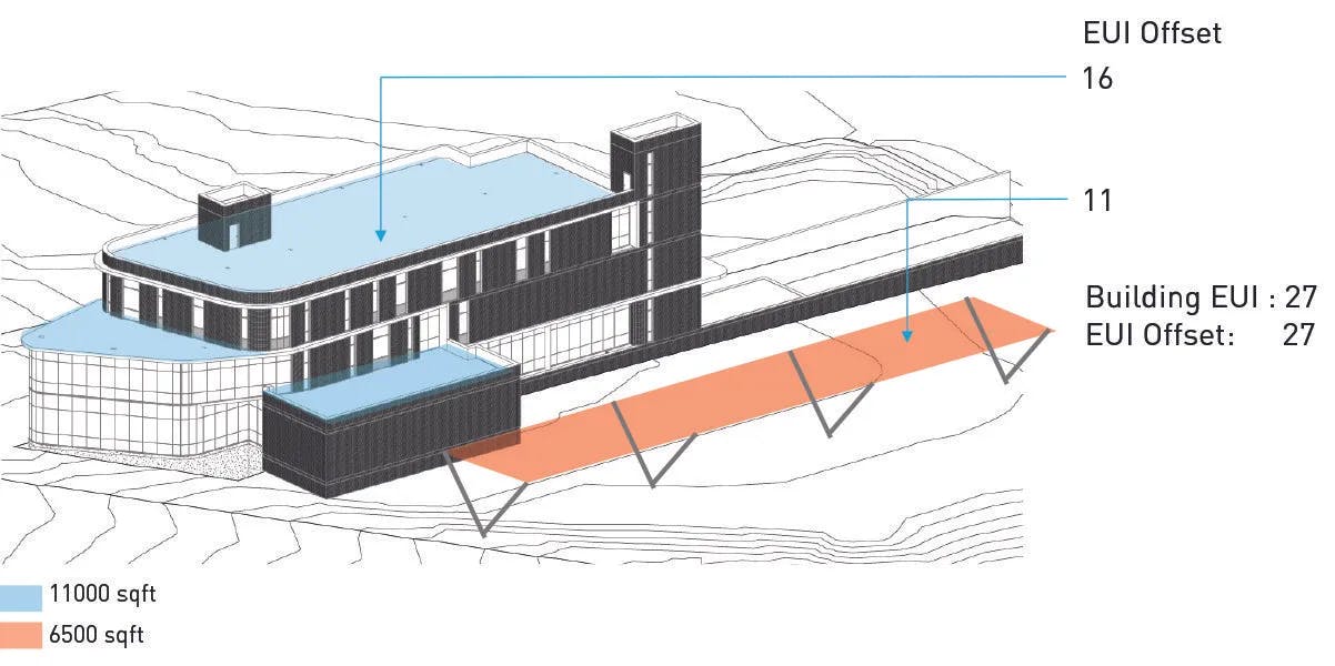
Solar
Solar access on the proposed design was studied to understand if it was possible to achieve net zero design with this building program and design. This study showed that if an additional PV (Photovoltaic) structure would be added on top of the parking, this could in fact pursue net zero energy.